
Fantasias of Color

Interpretations of coloration
Who does not love having a little color in their life? Colors are Wavelengths of the Visible Light Spectrum that humans can see and Colorimetry is the interpretation of Color Perception. But although coloration is vital to the success of artists, color affects all of us...in both our professional and personal living. I am fortunate to have had the pleasure of working with a gifted artist on the award-winning evocative covers of the award-winning Natalie Seachrist Visionary Hawaiian Cozy Mysteries, created by Art Director Yasamine June. You may not have access to such a professional, so I offer the following information to help you maximize the effectiveness of your use of color.
Regardless of whether you prefer dynamic coloration or accents of subtle shades of color on a white background, you can select Color Palettesof any type! One thing professional creatives are cautious about is the use of web-safe colors for work slated for online purposes. This 216 color palette is uniformly consistent with accurate display guaranteed on all monitors and web browsers.
Perception of Color
When viewed under varied lighting, a color sample's tone (intensity of color) or shade (how bright a color is) is perceived. Another aspect of color perception lies in the effects of color layering. And, while a designer may adhere to the few colors designated as "web safe," variations in monitor settings prevent absolute uniformity in how myriad viewers will experience color on a website. Even in hardcopy printing, variations occur because of batches of ink and toner, the moisture content of paper, and production executed on innumerable types and conditions of equipment.
Lighting - The intensity and type of lighting affects one’s perception of tone [intensity of color] and shade [a mixture of black with color which determines how bright the color is].
Layering - The layering of color also affects our view of it. For instance, putting a red color on an ivory background will produce a color that has hints of orange.
Tint - The tint of a color is determined by the amount of white it may have, which lightens the color.
Fantasias of Color
To help you consider more than your personal preferences in color, let’s explore classical as well as scientific aspects of colors and shades. In Murders of Conveyance (the second Natalie Seachrist Visionary Hawaiian mystery) the cover features my signature frame with the carved gold of Hawaiian heirloom jewelry and the classic red of ancient and modern China.
Red – Lowest in the color spectrum, this color is traditionally linked to sunsets, fire, blood, Mars the planet and Mars the Roman god of war. Philosophically, it has been associated with licentiousness and the concept of Satan. Red is now often associated with signature holidays like New Year’s, Christmas, and St. Valentine’s Day, as well as certain nations like China. This vibrant color calls attention to anything depicted in it, making it popular for advertising.
Yellow and Orange –Second in the color spectrum, these colors are associated with the sun and gold; depending on the hue, they are associated with the planet Mercury. Happy bright, and invigorating, they are used for many attention-getting purposes, often announcing deeply discounted items. Conversely, they highlight the richest and most valued products.
Green –Associated with the planets Saturn and Neptune, green is situated in the center of the color spectrum and is representative of nature. It is often used for health and environmental topics, products, and services, connoting harmony and peace. From a negative perspective, dark hues have been associated with envy historically. Military uniforms and equipment are often manufactured in mixed hues of green.
Blue –There are many hues of blue, which is third in the color spectrum. Associated with the planet Venus, it denotes harmony, devotion, and loyalty. In daily conversation, blue ideally speaks of clear and serene waters and skies. In many philosophical traditions, it has been associated with purity and loyalty. Today, the color is often utilized by financial and insurance institutions wanting to declare their honesty, and by healthcare providers wishing to project their dedication to the well-being of their patients and clients.
Violet and Purple –Although these colors are not adjacent on the color wheel, humans perceive them as related to one another. With both colors being perceived as blends of blue and red, these rich colors remain linked to ancient concepts of royalty, power, and wealth. Located at the end of the visible spectrum of light [literally next to ultraviolet], violet is the seventh spectral color, associated with the planet Jupiter. Violet is less saturated [intense] and displays more blue; purple is more saturated [intense, pure] and balances two spectral colors, red and blue.
Brown – The color brown is achieved by the mixing of different intensities of red and green. Like green, it is associated with the earth. Depending on its tone and shade, it reflects stability and hominess, or simple drabness. It is often found in presentations of natural or hand-crafted objects.
White and black are often paired for the expression of opposites, as in good and evil, the white hats of the good cowboys vs. the black hats of rustlers, the white dress of the bride and the black of a widow in mourning.
White –White is an achromatic color [without hue], embodying all wavelengths of visible light. It is historically linked to purity, cleanliness, truth, goodness, and perfection. Like black, it is a good background for highlighting all colors. It expresses honesty, and purity in advertising design.
Black – Absorbing all colors of light, this achromatic color is the absence of all visible light and therefore color. Obtained by the mixing of all primary colors, black is linked to darkness, night, and evil in historical religious written materials. Today it is viewed as expressing somberness as well as sophistication and elegance and is an excellent background for objects in both vibrant and subtle colors.
Gray – Also an achromatic color [without hue], gray is created by the mixing of white and black. Being neutral, this color is most often associated with conservatism, plainness, soberness, somberness, dullness, boredom, uncertainty, and advanced age. It can provide contrast in expressions of elegance when paired with white or black. To demonstrate the variety of color one might choose, I offer the following color palettes…Red, Green, and Blue.
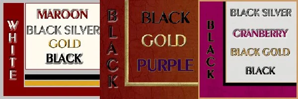
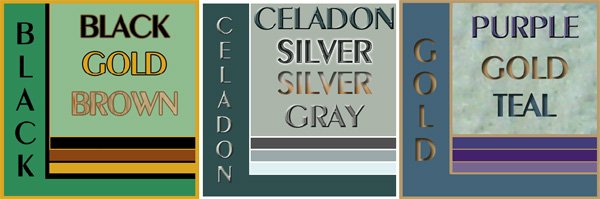
I wish you the best in your creative endeavors and hope this information on coloration will benefit you in both your personal and professional living! Dynamic plays on color or muted tones, consider opening your closets and drawers and take out some of your favorite items. Spread them out on a plain background (a bed sheet will do). Do you see a pattern in your choices? This is your own color (and design) palette. Now consider what remains in your storage spaces and rooms? You may not be planning any major changes at the moment, but it might begin a process that will benefit you in the near future! Now add a few pieces of jewelry, napkins, and anything else that you enjoy using. If it is time to make changes, consider whether there are people or organizations that may benefit from whatever you decide to delete from your possessions. I’d love to learn how this process works for you…you can send me a note through the Contact Page on the website!
Aloha, Jeanne