
The Author’s Colors

Coloration for the Author’s Brand
An author’s brand may be dictated by the genre in which they write. This is true for me, at least in works of fiction. The award-winning Natalie Seachrist Visionary Hawaiian Cozy Mysteries feature Island multiculturalism and pan-Pacific history within the rich environs of Hawaiʻi. The framing of the series’ book covers, the images within them, and the attire I wear when presenting myself as the author, all reflect an Asian Hawaiian theme. However, when an author is working in more than one genre, their personal design preferences may be far different from the genres in which they write. In such a situation, the author’s appearance may vary as much as their book covers. For example, when promoting Southwestern romances, the author may choose to wear a western hat and shirt; and when promoting a series of sci-fi books, the artist can be completely creative in the images of the book covers they coordinate with the author who can choose from a variety of compatible attire, and accessories when presenting their work.
While we are all affected by color, it is of particular interest to and utilization by artists, authors, and other creative professionals. I’m fortunate to have had the opportunity of working with an especially gifted Art Director, Yasamine June on the award-winning evocative book covers of my mysteries. For specific information on perceptions of color and the technical aspects of coloration, please visit my blog post, “Fantasias of Color” Here we will examine how an author can use color to establish and magnify their personal and professional branding! Contemplating your favorite colors may indicate your general design aesthetic. The overall question may be determining what attracts you to a color?
Scientifically, colors [hues] are specific wavelengths of visible light. When considering coloration in your writing…and book jackets…one of the first questions you might ask yourself is, “What is my design aesthetic? Is my product [the writing of elegant mysteries in my case] harmonize with my taste in art?” Beyond that, do you like the detail of classicism or the sharp clean lines of modern art? Do you prefer bright primary colors or muted tones? Like an artist, the author draws on a rich palette of images within their mind’s eye. But to effectively communicate with your clientele, your preferred palette may need to be tempered by the expectations of the audience [the readers of an author’s genre] with which one works.
Perceived Gender – This may sound like a dated, or even prejudiced, approach to design. But successful branding and marketing rests on defining and appealing to the demographics of one’s target market. Authors need to consider perceptions of their writer’s voice and the protagonist who may help define an appropriate color theme for one’s book jacket(s). Consider the differences between romance novels and police procedurals. In the first example, the author may have established an ambience that is classically feminine with soft, gentle, and elegant notes. In the second, there may be the description of a hardnosed undercover police officer [male or female] who wears black, employs harsh street slang, and fiercely responds to violence. While black is an excellent background for both genres, the artist’s treatment may vary considerably. The romance book often invites the reader to wonder what lurks behind subtle gradations and soft brush strokes of mystical colors and tones. In contrast, the police procedural usually pairs bold primary colors with dark shading set within sharp modern lines.
Regional Colors – For impactful branding, harmonize what you like with what is appropriate to your industry, the current era (unless your enterprise is retro-oriented), and your physical location...if you are identified with a particular region. Regionalism may seem an unusual issue to consider, but examining the color of green alone demonstrates my point. Growing up in Oregon, I was accustomed to the dark green of Douglas fir trees and the mosses that grow on them. When I moved to Hawai'i, the green of palm trees seemed pale in comparison, even when allowing for the bright island sun. As my perception of "normal" shifted, the greens of Oregon now seem dark and and sometimes even gloomy. Later, in Rhode Island, I rediscovered the dark greens of my childhood, plus the blue-green of New England shoreline grasses. In Arizona, the array of green is mixed, depending on topography, season and rainfall.
Another example of differences in regions are valued by the Black Hat sub-discipline of Feng Shui, the traditional Chinese philosophy for maximizing the harmonious use of space. Unlike the United States, which finds "greenbacks" and the color green to represent monetary value, China associates the color red with financial and overall prosperity. Envelopes containing money, [red packets] are traditionally distributed at weddings, New Year celebrations, and as employee appreciation gifts. You can explore the Internet for further examples of the significance of color through time and culture.
Through the dialect[s] of characters (as well as the scenes described), text may indicate colors distinctive to the locale of an author’s work. Within my work on both fiction and non-fiction projects, I’ve found the greens of trees and plants growing along the shorelines of the Hawaiian Islands [the setting of the Natalie Seachrist Visionary Hawaiian Cozy Mysteries] to be lighter than those of the hills of `Ulupalakua, Maui. So, ask yourself, which greens are most appropriate to my project? And what about the clarity and tones of blue in the waters and skies you describe?
Once you’ve completed your research and contemplation of coloration for your project, I suggest you write a paragraph outlining the elements you desire with a sample color palette. With colors identified by number in your art or text software program, this will facilitate communication with publishers and artists [should you decide to self-publish]. I should caution you that identifying the colors you wish to see on a book jacket is no guarantee of how the printed work will arrive at your doorstep. Even two editions of the same book, printed by the same company following the same instructions can yield variations in color because of differences in batches of ink or toner, the moisture content of the paper used, and production executed on innumerable types and conditions of equipment. Remember, analysis and employment of color can be playful as well as technical!
I hope that the information on coloration here and on my blog will benefit you in both your personal and professional living!
Aloha, Jeanne
Have You Had Your Colors Today?
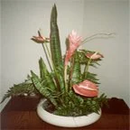
Place a bouquet of flowers on your desk…
…or wear a colorful scarf or tie!
Is it time for a change in your corporate or even your personal branding? Sometimes all that is needed is a tweaking of the colors, shapes and fonts with which you are already working. In other instances, it is time for a complete renovation.
Drop me a note through the Contact page to let me know how this works for you!